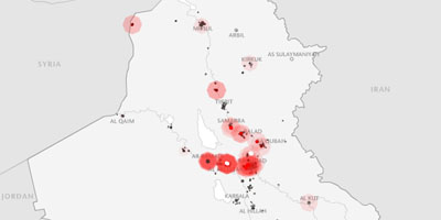
 animated visualization simulating the US & coalition military fatalities that occured in Iraq, shown in the context of time & (geographical) space. the animation runs at 10 frames per second, one frame for each day, with data taken from . might be interesting to overlay this with a similar chart consisting of Iraqi casualties over the same timeframe? []
 Time and Date follows Time Zone (Brussels)