 a beautiful 'visual browser' that allows users to explore & browse through a sample dataset (containing 150 persons, their tags & bookmarks) of the social bookmarking system, to see & understand the connections & relations of its entities.
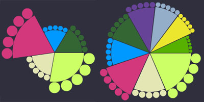
the data visualization groups related tags, users or bookmarks & shows their relationships in a colorful circular diagram. each entry is described through its top related entries (between 5 to 10), each represented through individual pie-chart segments. each segment shows at its edge 5 circles: its own five related entries. the angle of the segment is determined by the 'usage' of the entry (its relationship to the main entry), while its radius visualizes the entry's 'content value' (its relation to the whole system). selecting a segment in turn shows the specific visualization for that entry. [|thnkx Régine]
 Time and Date follows Time Zone (Brussels)
I found it to be slow and very unintuitive.
Hasn't Tufte said that pie charts are bad? (http://www.edwardtufte.com/bboard/q-and-a-fetch-msg?msg_id=00018S&topic_id=1&topic=Ask%20E.T.)
And is it just me, or do the groups look like feet?!?
I have to give this one a thumbs-down...unintuitive and overdesigned. Not to mention the colors are...kinda gross.
I fully appreciate all comments (as this viz seems to provoke different emotions).
but could we try to give a little more constructive criticism so the visualization designer could learn from them?