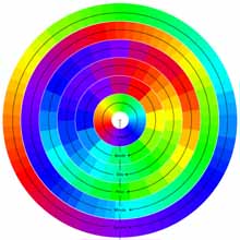
 a novel data visualization technique to represent time, based on the spectrum of the rainbow. every variable in the clock (second, minute, hour, day, month & year) cycles through the colors of the spectrum which begins with the color purple. all the variables are shown, with seconds being the outer circle & year the inner, while the years start over each one hundred years. see also video trace clock for a similar time visualization approach using live video images, & street clock, email clock, family tracking clock & DNA clock for other original clock approaches. [ & |thnkx Peter]
 Time and Date follows Time Zone (Brussels)
http://chromo.proteinos.com/