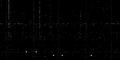
a dot plot data visualization focusing on patterns from digg.com, such as news trends, story connections/relationships, friend suggestions (future feature), & digging bots/fraud. the horizontal/vertical axis shows users/items arranged by numeric ID, so that the vertical strings represent individuals who have dugg a series of stories during a single hour (continuous strings are propably bots). dots are sized & colored according to the type of digg that occurred. red dots represent an item's first appearance in Digg. fat dots are diggs that took place before an item hit the front page.
see also smartmoney stock market radar.
[ & (mov)]
 Time and Date follows Time Zone (Brussels)