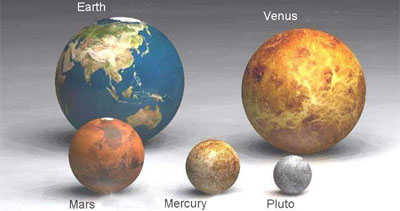
an infographical display of the relative size of planets & stars, varying from the tiny Pluto, over Earth to a 'huge' star called Antares.
see also world processor & science on a sphere.
[|thnkx Martin]
MORE
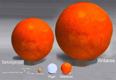
an infographical display of the relative size of planets & stars, varying from the tiny Pluto, over Earth to a 'huge' star called Antares.
see also world processor & science on a sphere.
[|thnkx Martin]
 Time and Date follows Time Zone (Brussels)
Nice images, but... Yuk, horrible compression artifacts in the images. People should know how to deal with this.
I couldn't help but think the same thing. The imagery looks like it was done very well, and then made super-ugly via compression. Shoot, I think I could make GIF's of those images that looked more palatable. Kinda sad. Neat idea, tho. Thanks for linking to it!
- Brandon
Houston, Texas
It looks like they lifted the images from another source. You can see areas where they 'erased' text near the names of planets/stars. I seriously doubt rense.com created these. I'd like to know who did.
Does any one know if these perspective sizes are even close to actual?
I saw the originals a couple of years ago. The "erased text" were actually Chinese characters (or Japanese, I don't recall quite well now). And yes, they were remarkably beautiful.
I don't know for sure if they were made exactly to scale, but judging from the quality of the original pictures and the emphasis on education in the Far-Eastern countries, I am inclined to say they are true to life scale models.
HOU, TX
Horatius, could you find the original images again? I think everybody who saw these images would like to see the originals, and maybe someone could make a better translation to keep the original quality...
go here to see intermediary photos for the planets and our sun.
http://www.rense.com/general72/size.htm