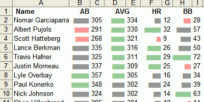
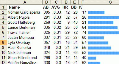
an extremely simple technique for adding simple bar charts or sparkline-like diagrams within the cells of an Excel spreadsheet. the already built-in Excel REPT function repeats any text entry a certain number of times. for instance, REPT(”X”,10) results in “XXXXXXXXXX”. so the trick is to repeat specific characters, such as a single bar “|” to create data bars.
see also a similar implementation in the upcoming Excel 12 & an artistic take as Excel drawings.
[ & ]
MORE
 Time and Date follows Time Zone (Brussels)
Wow thats cool.
If you rotate the text direction, you should be able to to vertical bar charts as well. Neat trick.
I think this simple command has a lot of utility in GIS applications: you get a quick infographic within its spatial context. I've referenced your post as well as JA's in my last blog.
Cheers
This is super cool trick. I can't wait to check it out.
I see the new Excel in Windows Vista is going to be able to do this automatically.
I did this in MS Access 2.0 forms to nice effect back in '97. Different fonts have different widths for the | character, with some mods you can make almost solid bars.
Really neat trick. Try using "g" as the character and Webdings as the font. You get completely solid bars.