
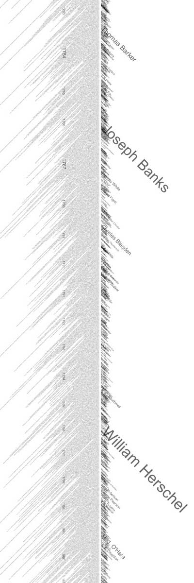
an extremely large timeline depicting the archive of papers published in the prestigious Royal Society's scientific journal, from 1665 to 2005. the entire timeline has been segmented into 10 sections, each 20,000 x 2,000 pixels. this visualization displays papers chronologically, with paper titles radiating downward from the vertical midpoint at a 45 degree angle. the size varies linearly by the number of number of papers published during that year's volume. the size of the author's name reflects how prolific they were.
some patterns that can be observed: paper titles become shorter over time, & there is a notable decrease in the quantity of papers published per volume starting around 1761, which significantly rebounds in 1970.
[link: ]
 Time and Date follows Time Zone (Brussels)
This is the kind of presentation that, in the hands of a clever investigator, clearly illustrates the value of computers in pulling a bigger picture from a huge set of data. And it's esthetically pleasing as well!