
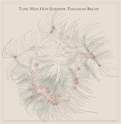
a beautiful & highly sophisticated "Map of Science", constructed by sorting roughly 800,000 scientific papers (shown as white dots) into 776 different scientific paradigms (red circular nodes) based on how often the papers were cited together by authors of other papers. links (curved lines) were made between the paradigms that shared common members, then treated as rubber bands, holding similar paradigms nearer one another when a physical simulation had every paradigm repel every other: thus the layout derives directly from the data. larger paradigms have more papers. labels list common words unique to each paradigm.
this image was recently published in .
see also Royal Society academic papers visualization & scientific literature citation trends network diagram.
[link: & (detailed JPEG image)]

 Time and Date follows Time Zone (Brussels)
I saw this in the last couple of days -- you can buy them:
http://informationesthetics.org/node/20
wow, that is something else. I can only imagine the person holed up in a cellar making that.
Thanks and keep up the stellar sitemirc