
[from at ]
Information visualization for lay users seems to be a pervasive theme at the InfoVis conference this year. , Deputy Graphics Director at , gave a keynote entitled: "".
He explained how a 30-person team creates the impressive infographics and visualizations we see on the newspaper every week. Matt emphasized their role as journalists (instead of illustrators) and explained how they get from raw data to finished graphical pieces that make information understandable for more than a million readers.
[link: (infovis presentation slides, ZIP format, 70mb)]
 Time and Date follows Time Zone (Brussels)
sounds like a terrific presentation, I wish I had Matt's notes when viewing it! speaking of scatterplot, I like very much what they did on 38. It works much better to use a full page to show a big scatterplot, then 4 smaller "views" of it emphasing on one part of the graph, than trying to cram everything on one graph. Result: a scatterplot that works.
I also like what they've done in the 69-77 section about "honest maps". even reputable data publishers present maps which are most often biased.
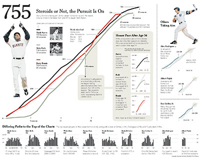
the last graph I liked very much is the one on p94. when composing a graph the natural trend is to chose a scale so all the data points fit. here, doing the opposite and letting the WWII numbers break lose is very effective, "à la Al Gore". thanks for sharing.
btw, in the wake of the movie there are plenty of simpson avatar generators for you to try :)
-jerome