
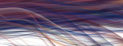
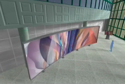
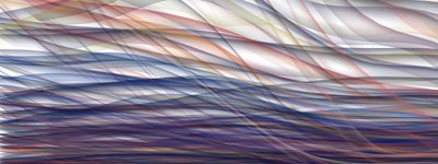
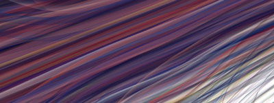
a collection of studies, visualizations & process documents from a data visualization installation commission for the US Census Bureau, which visually depicts the US population by county. what might normally be seen as over 60,000 points of abstract data becomes a dynamic & organic vision of color and form. this large, site-specific project will be installed in the lobby of the US Census Bureau in Washington, D.C.
"This project aims to present a broad stroke of data, from the premier information-gathering organization in the world, as an abstract mural. This is not a trivial matter, as the transformation of numbers into visuals is a tricky thing. The main question is: How does one find a balance between truth-in-data & the pure joy of form?"
[link: ]
 Time and Date follows Time Zone (Brussels)
Does this convey the information? It doesn't elucidate the subject matter to me, I'm afraid. It seems too abstract to be useful.
I guess it is not suppose to be useful. That's the point you decide if a visualization you are creating will;
-be useful, and understandable
-be aesthetically beautiful
-content will be interesting/beautiful/meaningful.
This piece meets only one of them probably, but it is ok.
The PDF at http://salavon.com/AmVar/AmVarIntroWeb.pdf implies that it has multiple pages, but I only see one. I'd love to see some detail on the methodology. It's certainly beautiful, and it would be great if there were appreciable content in there as well.
Is a strictly conventional/literal usefulness, eg as a tool, critical for appreciation? The aesthetic purpose of this work would be sufficient to enjoy, and the repurposing of content for such an aesthetic flourish may be the start (continuation?) of new modes of consideration, appreciation. Must we know a literal purpose for a rainbow to enjoy?