
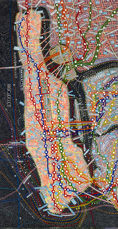
a collection of artistic, information-loaded maps by Paula Scher that focus on the abundance of information that inundates us daily through newspapers, radio, television, & the Internet to reveal the fact that much of what we hear & read is strewn with inaccuracy, distorted facts, & subjectivity. " dynamic images are saturated with layers of elaborate line, explosions of words, & bright colors creating a plethora of visual information that produces an emotive response to places lived, visited, & imagined."
[link: |via ]
 Time and Date follows Time Zone (Brussels)