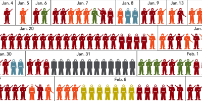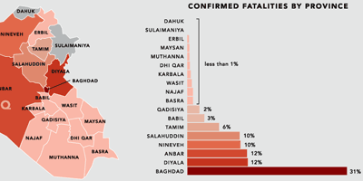
infographic representing the type and location of each attack in the Iraq war, responsible for the 2,592 recorded deaths among American and other coalition troops, Iraqi security forces and members of the peshmerga militias controlled by the Kurdish government.
[link: & |thnkx ]
see also: Iraq war maps, infographic movie, casualties for dummies, casualties infographic & fatalities.


 Designed and Maintained by
  Time and Date follows Time Zone (Brussels)
* This is a great visualization! However, I think there is still room for some improvement. What would catapult this into a Top 2008 category are some interactive components. I find it difficult to differentiate between the minute changes between police officer and Iraqi security. If this were setup so that you could make a selection with simple check boxes and filter out information that would be ideal.
* For example: I want to see the days Iraqi Forces were killed by car bombs. I check on both and those are the only ones shown. All others fade away or are muted.
* The vertical bar chart is nicely done and lets me quickly see where the highest/lowest percent of fatalities occurred by province.
* There are some “analytics” that I would add to be able to do more with this data. Perhaps use it to make decisions or at least learn more about potential patterns or trends. I see a great visualization like this and it leaves me wanting more and wanting to do more with it.
* Similar to 2007, the folks at NYT continue to impress!
it's a nice visualization! I just think soldier icons are too similar.
Tony makes some great points about a great infographic. I'd like to add that there should be more of a difference in color between car bombs and torture\decapitations. (There's a sentence I never thought I'd type!) Since death by torture is rare, thank goodness, but also the most barbaric, I would have made it a color that stood out the most in comparison to the others.
a detailed study of this visualization in german language (with references to neurath and isotype) has been published on this website yesterday:
http://www.zintzen.org/2008/01/09/i-sotype-a-year-in-iraq/
I agree with the comments about the icons being a little too similar. This is good to see! It is too bad there isn't even (American) data to do this for dead Iraqis.
Like General Tommy Franks says "We don’t do body counts" I guess that is up to the "liberal" media and NGOs.
They certainly have improved from last year. The NYT ran the same style graphic in the paper last year and being just black and white it was a nightmare of information and organization.
This looks a bit better, but it still laboriously redundant.
Nice to see the iso little guys used. I think tho that overall the graphic is to large for the average monitor, and the fact that the days are shown serially (and the borders are light in color) doesn't make it easy for the viewer to perceive the daily variation in casualties, or when there were very few or very many losses. What stands out are red and yellow guys, the other guys start receding, at least for me.
It is very impressive as a single gestalt visual, but doesn't reveal inner patterns that easily. Cool to see NYT do it, tho.