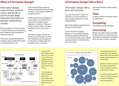
 a booklet that aims to introduce advocacy & non-governmental organizations to basic principles & techniques of information design. clearly, "information aesthetic", "casual", "", or "" visualizations are playing a big part in the communication of data-rich information in more subjective ways, such as the highlighting of concepts 'about' the data, instead of focusing on patterns 'within' the data.
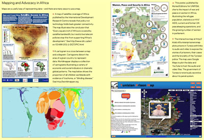
so it comes to no surprise that many of its examples have already been blogged here, including Exxon Secrets & Iraq Casualties & Gapminder & Worldmapper. the booklet also contains tips, excercises, & recommendations of Free Software packages to help polish up information graphics.
putting such works together as guidelines for others is a courageous initiative. people interested in the subject should also look at govcom, which is unfortunately not included in the booklet.
[link: |thnkx John]
 Time and Date follows Time Zone (Brussels)
I think this booklet is great. A much needed intro for nonprofits. I'm a big fan of design and visualizing data sets for social causes (makes sense that I'm a fan of your blog =)
http://www.alldaybuffet.org/2008/02/28/advocacy-and-information-aesthetics-go-good-together/