
a set of sophisticated data-driven interfaces documenting the historical activities of the Spanish national scientific research institution (JAE) between 1907 & 1939. in particular, the online application allows the user to study the history of the institution, the movements of the students it funded & the academic documents that they have been produced
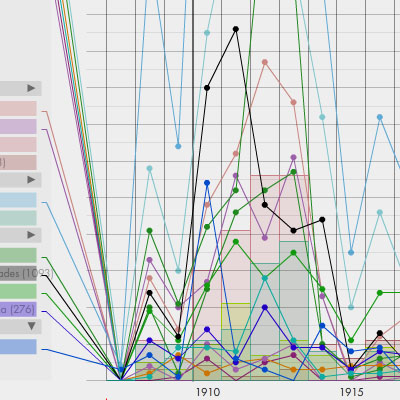
Cronos is an interactive timeline visualization in which the user can explore the activities of the JAE over the course of its history, combining such variables as the gender, place of origin & destination of the beneficiaries & the subjects they studied.
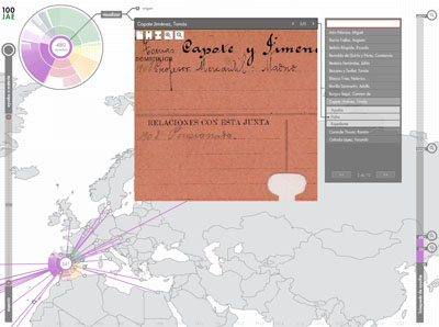
Red is a navigable network that lets the user explore the activity of the JAE by way of the relationships established between individuals, institutions, documents & subjects.
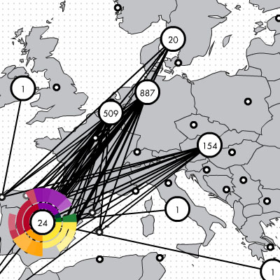
Geo is a geographical module that offers the user the option of exploring the work done by the JAE on a map, identifying the countries for which grants were given & the specific subjects researched there, with a series of nodes (cities) & relationships (journeys) deployed on a navigable map.
[link: ]
 Time and Date follows Time Zone (Brussels)
RED looks simple and easy to use yet has MANY clicks to do before you really see anything.
The two others are just plain confusing even though they might look neat