
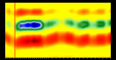
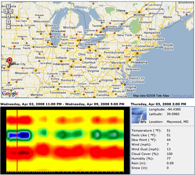
an alternative weather forecast visualization method that compresses 6 main weather parameters into a single image. every vertical line in the image is the colored representation of a data record with 6 main weather parameters for a particular time of the day (or night). the more similar the color patterns of 2 different vertical lines, the closer are the weather conditions they represent on the image.
users can analyze the image from left to right to spot color patterns occurring during the entire forecast period, which usually point to certain patterns in weather conditions, or even weather anomalies. for instance, almost every location will show 6 (by the number of days the forecast is given for) easily identifiable day/night color transitions as weather conditions at those times of the day significantly differ, especially in northern areas. the dark blue or dark red spots usually point to spikes in certain weather parameters like temperature, wind speed or cloudness, & result in weather anomalies like rain or severe thunderstorms.
[link: ]
 Time and Date follows Time Zone (Brussels)