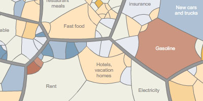
an interactive infographic treemap representing how much the average American citizen spends on 84,000 products in about 200 categories, including fast food, car insurance, rent, electricity, garbage collection & so on. larger shapes make up a larger part of spending. individual shapes can be selected & the treemap can be zoomed in & out.
the combination of the organic looking treemap shapes & the encompassing circular form reminds me of the voronoi treemap & circular treemap algorithms respectively.
[link: ]


 Time and Date follows Time Zone (Brussels)
Great treemap! I can attest to the increase in carbonated drinks year-over-year. I may have single-handedly caused the spike... It's also shocking how large of a part gasoline has become. It would be interesting to see how the U.S. map compares to other developed countries.
The resemblance to the voronoi tree map is not coincidental. The NYT image is credited to "Michael Balzer, University of Konstanz (Germany)" who is the lead author on the Voronoi tree map paper:
http://portal.acm.org/citation.cfm?id=1056041
indeed Marmaduke, well spotted!
it thus seems to be an interesting case where recent scientific research comes together with real-life and commercial practice. is it a coincidence then that the voronoi algorithm is both useful and beautiful?
in addition, I would be interested to know how NYTimes infographers inform themselves about recent research results in the field of infovis?
My commentary on this and another NY Times visualization: http://intelligententerprise.com/blog/archives/2008/05/for_the_new_yor.html