
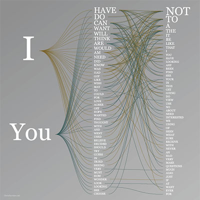
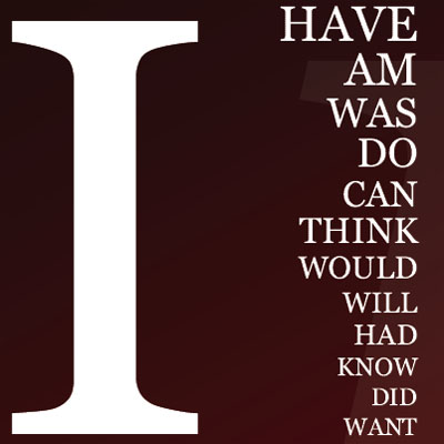
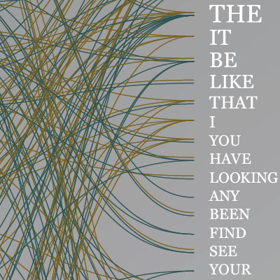
a set of relational visualizations represent the relative frequencies of trigrams as they appear on the web, based on a massive (100GB) from Google's corpus archive. n-grams are pieces of sentences. a trigram (n=3), for example, might be "I like food" or "frog is tasty."
the first visualization compares the 120 trigrams of the terms 'He' with 'She', while the other is based on 75 trigrams of 'I' & 'You'. the frequencies of the 2nd word in the trigrams were sorted in decreasing order. words are sized according to the square root of their use frequencies. the color-coded lines act like paths (similar to a tree structure), enumerating all of the occurring trigrams.
[link: ]
 Time and Date follows Time Zone (Brussels)