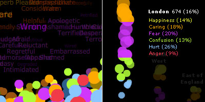
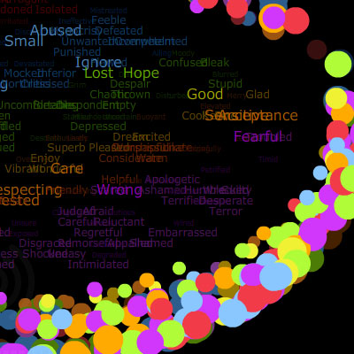
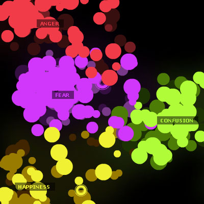
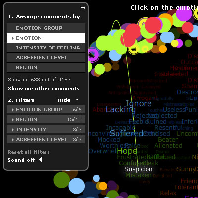
a data visualisation tool which tries to analyze the debate sparked by the of programs which aired on BBC2. the interface shows a number of particles floating around in space. each particle represents a sentence taken from the debate & is assigned a color corresponding to the type of emotion (i.e. anger, fear, hurt, confusion, happiness & caring) word found in the sentence.
particles also have a size which reflects the intensity of the emotion expressed & a brightness which indicates the average consensus (agreement/disagreement) on the comment. comments can be spatially clustered by their attributes & particles can be filtered to show exactly what the user would like to see at any given time.
[link: & & |thnkx Andrea]
also see other projects originated at BBC:
. British history timeline
. most popular news stories
. mood news headlines
. tv schedule similarity
 Time and Date follows Time Zone (Brussels)
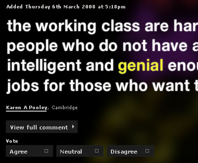
Like other attempts to visualise "emotion" by parsing text this really runs into trouble - click through to the comments to see the analysed key terms and how often they are misrepresented. This is a great example of style over substance in a data vis, and more worryingly an example of the way the form can turn highly charged data into a pretty but meaningless cloud of dots. The prospects for using data vis in this domain are fascinating - unfortunately this is a bad example.
Agree with Mitchell. It's also kind of a knockoff of We Feel Fine.