
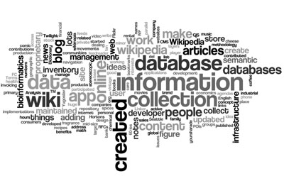
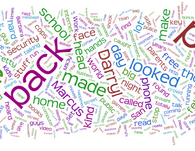
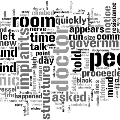
an online tool for generating beautiful “word clouds” from user-provided texts, such as plain text files or del.icio.us tags. the clouds give greater prominence to words that appear more frequently in the source text. users can tweak their clouds with different fonts, layouts & color schemes. users can also print them out, or save them to the Wordle gallery to share with friends.
unlike a normal tag cloud, 's uses the interior space of the words & letters... the result is simple but beautiful.
[link: |thnkx !]
see also:
. presidential speech word cloud
. semantic word cloud
. newzingo
. groop.us
. data cloud
. word news
. the voice
. power of words
. tagged colors
.
 Time and Date follows Time Zone (Brussels)
Simple? Maybe. Beautiful? Maybe.
Readable? Insightful? Analytical or communicative? No. So what's the standard for evaluating these things? Shouldn't it be whether they improve our understanding of the information more than other methods of "visualization"?
This is very interesting. As a web designer, and therefore a very visual person, I think these tag clouds are much prettier than the plain ol' Arial ones we normally see. However (and I am still speaking as a web designer), I'd be reluctant to use such a tag cloud on a website intended for a broad audience. While they look cool, I feel the accessibility and usability issues they pose outweigh the benefit of being different, unique, attractive. Like you, tag clouds in general are something I am undecided about. I do know this, though: someone with impaired vision, be it blindness, color-blindness, near-sightedness, whatever... would have a heck of a time being able to use these prettier ones. And, like with everything in design, it all comes back to finding the balance between form and function. In this case, I'd be going the function route.
Granted, I haven't looked into the wiring yet, so maybe there is a way to make them degrade gracefully into a more easily readable format.
Do you mind if I skink this info and put it out on my own blog? I'd like to see what my designer colleagues think as well.
Great post!
Durr, I meant to leave this comment on another blog that links to yours. While my sentiments remain unchanged, I apologize for the error.
glenn-
It's not supposed to be useful. it's supposed to look nice.
Well, it looks nice. But, um, shouldn't it be supposed to be useful?
As Charles Eames said, "Who would say that pleasure is not useful?"
not useful? in addition to the utility of beauty, the practicality of giving the untrained the means to display and to discuss information in non-linear and non-traditional ways is sorely needed.
if we save one person from death by powerpoint, than we have saved the world.
Any enemy of Powerpoint is a friend of mine.
I'm with glenn on this one. It's nice for 5 seconds, but has no depth and no compelling story.
I've just discovered Wordle and really like it. But as an educator, am wondering what uses it may have for school aged children. Or am I thinking too deeply here?
I love using wordles. who wants to look at boring across the lines stuff? I use them all the time for school projects.
This is very cool - these clouds speak directly to my right brain, no need to even read them; in a flash I get the message, context, content, data, lesson, mood, speed, emotion etc...
I now use it to flashcard conversations, meetings, phone conferences... all I do is define a theme then input the words as I copied them. A quick glance takes me right back to where it came from, who, what, how and why.
That is quite interesting, Check out this wordle projcet it gives a new perspective of looking at the inuagural addresses (all of them). Its much easier to digest than reading them all, however looking at wordle may just intrigue one to read the whole address. You may even be suprised by some of them. There is a stark contrast between lincolns first and second.
http://www.governingdynamo.com/blog/2009/8/19/take-a-look-at-some-historic-american-rhetoric.html