
Guest-blogging on infosthetics.com is a tricky proposition. Since my last post the majority of things I've wanted to talk about have already been covered by our diligent host, .
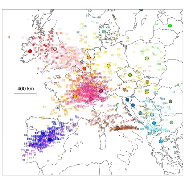
Thankfully I stumbled upon [flickr.com] from the . It shows a 2D plot of genetic similarity across Europe, colour-coded by country, alongside a political map of Europe using the same colours. A simply striking way to illustrate the complex process of reducing a multi-dimensional data set.
Sadly though, my (admittedly brief) attempts to find more information were confounded by , and . At least the latter provides a large format image for download! It's been a while since I was in academia, but I recall fondly being able to navigate the websites of scientific journals relatively freely from a university network, and being surprised when the same links failed at home. It's a shame so much good work is done behind closed doors, and that it's difficult for those of us outside the science community to correctly attribute and follow-up on interesting research.
I did find one [technologyreview.com] though, and I'd love to read more. The methodology seems to be related to the project, which thankfully has lots of information available to the public, and was earlier this year after being .
The use of side-by-side maps also reminds me of [pin-the-tail.com] showing the correspondence between increases in Democrat votes in the 2008 US election and cotton production in the 1860s. Again, an effective visual comparison presented casually on the web but it's almost impossible to follow up and find more. , including matching up the maps for a closer look at the correlation.
See also: .
Guest blogger is an interaction designer at . He has recently contributed to several successful visualization projects including , and .
 Time and Date follows Time Zone (Brussels)
Nice one.
The big gaps in the genetic image seem to fall roughly along mountain ranges - Alps, Pyrenees.
A Dutch newspaper published this version of the map. I'm not sure it's better than the ones you've posted. But one thing becomes very clear from that display: the Finnish have nothing in common with the rest of us Europeans!
See also this article at scienceblogs.com.