
The Tweetsphere is already quite crowded with aggregate and visual interfaces (think , , , , , , and ), but this one seems to stand out in terms of its interactive and real-time tracking features, maybe conceptually similar to those found at .
[pepsicozeitgeist.com] is an online tweet visualizer, designed by , that takes the pulse of , a five day symposium celebrating the best minds and the brightest personalities of emerging technology.
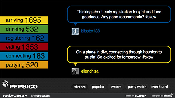
Tweets relevant to the festival are ordered by category (e.g. arriving, drinking, registering, eating, connecting or partying), analyzed for popular keywords, geolocated on a map of Austin, or filtered by highlighting quotations within tweet messages.
Interesting panels at SXSW include: , , , , , T and .
Any person attending SXSW wishing to guest blog about these topics is more than welcome at infosthetics.com!
 Time and Date follows Time Zone (Brussels)
I dunno. For all the effort put into visualizing twitter and tweets, what use do we really get out of it. It all just seems like api porn to me.
I like the term "API porn"! :)
It even does not turn up Google results yet.