
We (= the academic information visualization community) would like to encourage you to participate in collecting and discussing real-world stories that describe the real impact of data visualization. In the research community, we are very interested to see our tools and ideas being used by a wider audience. Yet, once ideas and tools have been published and made available, stories about how these tools and ideas are applied by various user groups rarely reach a wider audience. That is exactly why we recently created the .
In order to help us understand more broadly how visualization impacts people's work or lives or leads to valuable decisions being made, we are now looking for you to send your impact stories to the . We are also interested more generally in any comments about this initiative itself: Is it valuable? How can we best demonstrate the impact of visualization? This year's exhibition will be part of the . In contrast to a common academic contribution at a conference, we are looking for entries which share how a specific visualization tool or technique has impacted the people using it instead of describing the tool itself in detail. The deadline for this year's submissions is July 19th ().
In the weeks leading up to the submission deadline, we will publish short summaries of last year's entries here on infosthetics.com. In the meantime, we want to start with a great example from last year.
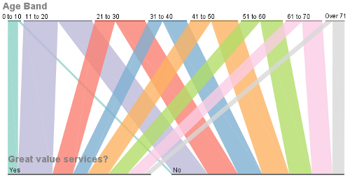
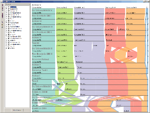
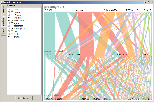
Read below for a short introduction to the impact of a visualization technique called Parallel Sets.
This post was written by , postdoctoral researcher at .
 Time and Date follows Time Zone (Brussels)