
Might this be the best example of a truly persuasive visualization for the masses?
In this age of impending climate change, encouraging the thermal insulation of buildings has become an important factor in reducing energy costs and minimizing carbon emissions. Out of most existing buildings, a significant amount of heat escapes unnecessarily, and at least 30% is typically emitted through the roof construction. Many governments throughout the world attempt to tackle this problem by supporting the insulation of roofs through , t and other .
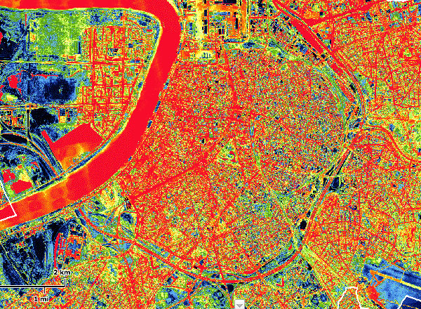
But how can individual citizens determine whether such a costly renovation is worthwhile for their own house? The online project "" [antwerpen.be] tries to help solve this question through a relatively simple visualization. During the winter of 2009, a small airplane with an infrared scanner made a wide sweeping thermal scan of a large part of Belgium, which resulted in the largest thermographic map currently available online. Inhabitants living within this area are able to select their home address and answer a few questions (such as the angle of the roof). in order to determine for themselves how their own roofs actually perform.
 Time and Date follows Time Zone (Brussels)
This sort of information can really empower people - how bad am I compared to my neighbors? - that's so much more tangible than r-values. Imagine Google doing something like this for US cities (and suburban areas), and creating an energy dashboard showing how much you could save by bringing your insulation at least up to the area average, or the payback period for doing XYZ....
This is great. I want to see this kind of data available everywhere.
It really helps to get a visual sense of how much energy we waste by not buttoning up our buildings right.
For those interested in making their homes more efficient, our site provides a ton of useful information: http://www.energycircle.com/learn
Thanks (again and again) for the visual+mental stimulation!
I would love to see this come to St. Louis, MO, USA. My new company's project would be greatly enhanced by something like this. How wonderful!
Second picture shows that there are "cold" and "warm" regions. It would be good to see the city that I know well, then I will be able to match types of building with "heat escape"
Um wouldn't the biggest wasters be government, military and industrial? An average house doesn't even come close to the energy wasted in a large in a large factory in a single winter day (or night)
I think there is distinction to be made between energy being used and energy being wasted.
Looking at the map, the industrial area's seem to score the best. Either many of the warehouses are well insulated, or more likely, no energy is being wasted by trying to heat them in the first place.
Public transportation such as the airport and the central station score well too.
I don't think the forts around Antwerp are still used as military bases, but have found new uses, yet they too don't seem to be doing to badly either.
So looking at this map, the biggest offenders are homes and office buildings. Taken as a whole, that's a lot of energy that is being wasted. Especially considering that a well insulated passive house wouldn't need additional heating during most winters.