
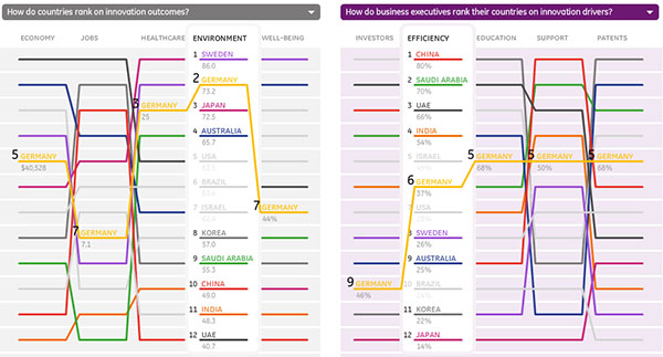
In , from has contrasted the drivers and the impact of innovation of various countries by way of an interactive line ranking.
The visualization uses quite a large set of different datasets, ranging from Gallup and business schools reports, to the usual suspects like the UNESCO and the World Bank. The interface requires some trial-and-error to get used to (e.g. the data categories at the top are clickable), but creates a compelling overview of how different nations actually perform versus how their business executives perceive the same issue.
See also CFO Outlook Survey: How do Financial Executives View the U.S. Economy from the same author.
 Time and Date follows Time Zone (Brussels)