
[carbonvisuals.com] is the "world leader" visualizing carbon dioxide emissions and other greenhouse gases.
Accordingly, CarbonVisuals have already developed several visualizations that aim to make such emissions feel more real, and in particular more graspable, as it compares the physical dimensions of several tons of CO2 emissions to everyday objects.
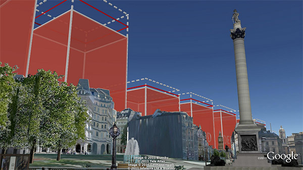
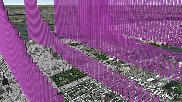
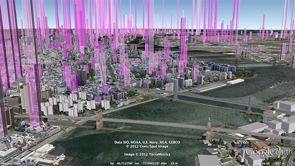
For instance, the CO2 emissions of the city of New York has been as a huge mountain of blueish balls - each basically representing 1 ton - that overgrow a 3D virtual city model of New York, while the according emissions statistics of its buildings has been turned into life-size - or huge-size - . Alternative renditions, ranging from the level of a to that of a single , exist as well.
Watch the movies below.
 Time and Date follows Time Zone (Brussels)
So, I'm curious -- how much is the data in the "carbon dioxide balloons" video, fudged, or "creatively shaped" for effect?
The "one year" pile appears to be much, much larger than 365 times the one-day pile. 400 one-day piles is only a 20x20 grid of one-day piles, and the one-year pile appears to be larger just on the base alone, than a 20x20 grid, plus it has the additional volume of the added height...