
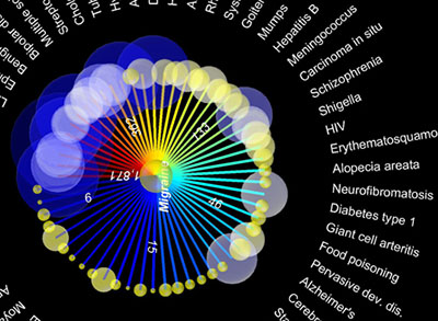
a sophisticated information visualization showing the overlap between 161 different diseases by studying epidemiological data from 1.5 million patients. more specifically, this research examined the likelihood that a patient with 1 genetically complex disease, for example diabetes, also had one of the 160 other diseases under study, such as an autoimmune disorder.
red lines between diseases indicate a positive correlation, while blue lines indicate a negative correlation. the thickness of a line corresponds to the strength of the correlation. the size of the circles corresponds to the relative size of the patient population for each disease, ranging from about 20 to about 136,000 people.
[links: |via ]

 Time and Date follows Time Zone (Sydney)
Actually, the first map is awful. There isn't a single connection I'm able to follow without getting crossed with multiple other connections getting in the way. Some maps weren't meant to be.