
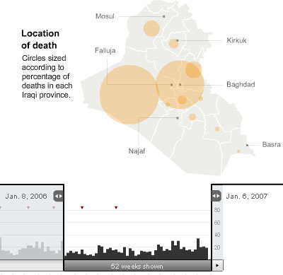
interesting interactive infographic (e.g. locative map, date-based bar graphs & minimalistic photo matrix) illustrating the 3,000 (American) deaths in Iraq & where they died, over time.
see also Iraq was fatalities & Baghdad versus San Francisco & casualties as candy & How 9/11 changed America & conspicuous casualties.
[link: |also ]
 Time and Date follows Time Zone (Brussels)
That's a chilling use for a great infographic.
Just to be totally clear, those are the 3,000 American deaths, we would be lucky if that were the total number of deaths in Iraq.
I also suggested to offer a better inverse-relational-related information to improve the understanding of the fenomena as wrote here: http://www.mentegrafica.it/blog/?p=151
hi Daniele,
I did not know you posted already review. thnkx for the link!