
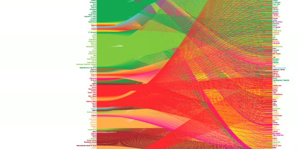
The recently released book "Data Flow: Visualising Information in Graphic Design" available at and seems to be an ideal Christmas gift. The book introduces an expansive scope of innovatively designed diagrams, and presents an abundant range of possibilities in visualizing data and information. These range from chart-like diagrams such as bar, plot, line diagrams and spider charts, graph-based diagrams including line, matrix, process flow, and molecular diagrams to extremely complex three-dimensional diagrams. Or, put differently: "The more concrete the variables, the more aesthetically elaborate the graphics - sometimes reaching the point of art - the more abstract, the simpler the readability."
While infosthetics would *love* a review copy to be featured on this blog, some teaser images of the book seem already quite seducing, and the quite appetizing. Thnkx Jonas.
UPDATE: Corrected Amazon.com link

Your Amazon link isn't working, so I clicked in via your shop - I hope you get your slice. Nice find!
While you wait for your copy :P - you can read a review at the Designer Review of Books website:
http://www.designersreviewofbooks.com/2008/11/data-flow/
Thnkx Andrew. A real pity of my typo, and I appreciate a lot the extra length you took!
Will be eagerly awaiting the copy, Jonas! (Why did I miss the book when it came out, I have no clue...?)
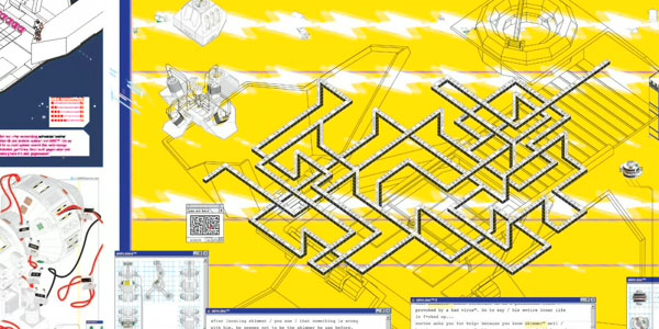
The "Yellow Maze Path" exactly represents the identical information flow in the last organization I worked for.
Notice how the "initiating entry point" on the left, has to travel to the extreme right, for its "first ciontact"... BEFORE circulation commences.
And at its second contact - one of the routes is back to the "initiating point".
Probably a perso who found a spelling error in para 1 and never even read the document...
I love it!
I got this book as a birthday present and: I´m in love. I think its a great range of current information design. It is very inspiring so have fun with it ;)
As info design approaches the realm of abstract art, it starts losing its power to effectively convey data. The core signal is lost in the noise of the 'art'. I find the graphics just about worthless as a mechanism for conveying information to a lay person.
@jon. I appreciate your comment but think your critique is too general. One should discuss the value of "art" in information design on a case by case basis. Clearly, information design without any "art" is not the solution either. More particularly, the issue I point to in much of my own research and on this blog in particular, is whether we can discover if any functional relationships exist between the two areas.