
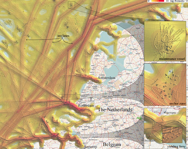
In the academic paper titled "", PhD student proposes a new geographical visualization technique to support operators of coastal surveillance systems to get insights in vessel movements. The visualization is based on the calculation of a density field that is derived from convolution of the dynamic vessel positions, which is then shown as an illuminated height map.
The combination of two fields (i.e. a large and small kernel), provides overview and detail: a large kernel provides an overview of area usage revealing vessel highways. Details of speed variations of individual vessels are shown with a small kernel, highlighting anchoring zones where multiple vessels stop.
The base visualization shows shipping movement during smooth weather around the entrance of Rotterdam harbor. Three north-south sea lanes appear, while several anchor zones pop up by the highlighted dots of the individual trajectories. Furthermore, some maintenance vessels move slowly in a small area, typically around an oil platform or a wind mill park, which can be observed by the intense individual trajectories.
See also Humpback Whale Behavior and Revealing Suspicious Ship Sinkings.
Via .
 Time and Date follows Time Zone (Sydney)
And once again, behind a great paper a great researcher, Jarke J. van Wijk, just like in your previous post: http://infosthetics.com/archives/2010/06/what_is_the_best_arrow_representation_in_visualizations.html#comments
:)