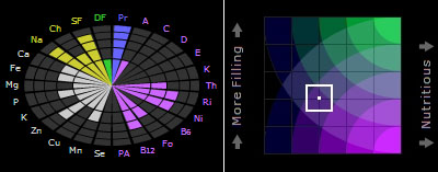
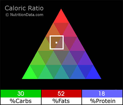
 an online visualization tool that allows for the visual exploration of foods with specific caloric ratios, 'fullness ratios' & quality ratings. the Caloric Ratio Pyramid shows how the Calories in food are distributed between the different macro-nutrients. the Nutrient Balance Indicator illustrates the density of essential nutrients in food. the Fullness Factor maps food in relation to common nutritional goals.
see also mc donalds menu charts.
[]
MORE
 Time and Date follows Time Zone (Brussels)
Do you know the type of visualization this is? I would like to understand how to reproduce this.
The caloric ratio visualization looks like a triangular graph to me. The three elements have to add up to 100%
For another example, go here:
http://www.projectrho.com/rocket/rocket3t.html#shipgrid
and scroll down to the grid.
wow, that is a nice example, winchell!