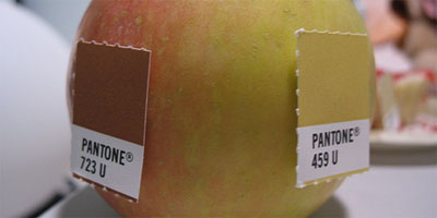
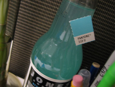
a set of photographs that collects matches between Pantone color codings & real world objects.
see also color analytics & color of my sound & color music organization.
[|via & ]
MORE
a set of photographs that collects matches between Pantone color codings & real world objects.
see also color analytics & color of my sound & color music organization.
[|via & ]
 Time and Date follows Time Zone (Brussels)
I agree with the bottle, but not with matches near an apple.
That's funny, because i was thinking the apple & tags appeared to be good matches, whereas the Jones soda didn't seem to match as well.
Apple, yes; bottle, no. Though my favorite is the Red Velvet Cake on the site. I'll never see Pantone 177 the same again.
immediately cute but ultimately.. what? i'd like to see the results mapped, and also what the ultimate end of this excercise is (even if it's just for personal amusement). what can we gain from this, and where can it lead us? i mean creatively and intellectually. for example, i like the way it illustrates the extreme limitations of the pms system - most of the matches are way off.
I agree with trogdor
Yeah I agree that the soda isn't quite a good match. I do love working with pantone though.
Such a good idea - wonder if they all use the same camera though and the same lighting?
paylaşım için çok teşekkürler / very very thankss
I like the apple pantones, but the bottle doesn't even match!
The bottle does not match at all! The apple pantones are a much better match!
I think the Dulux colour checker would have a thing to say about the pantone colours!