
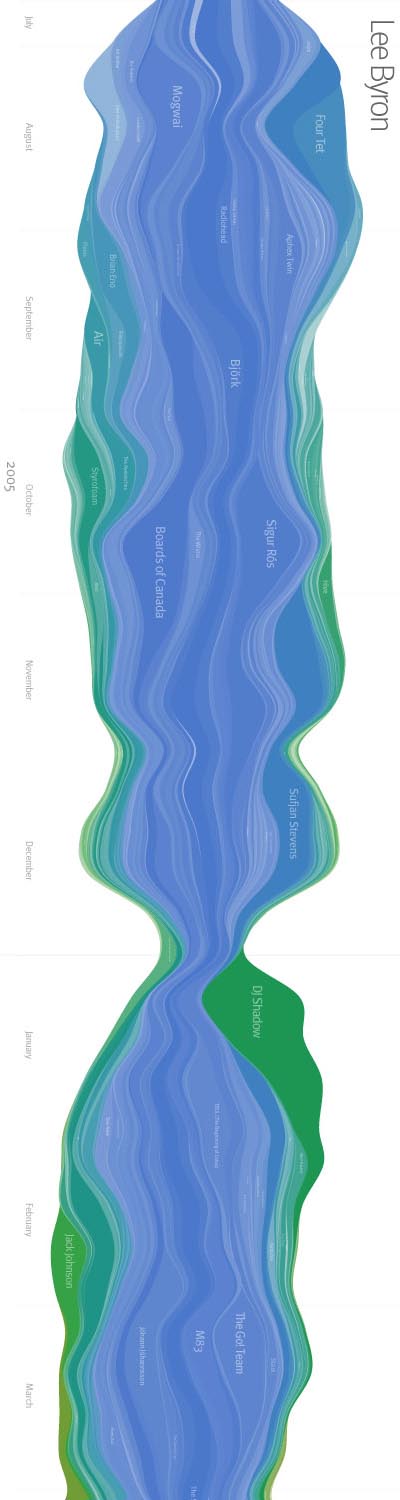
an algorithmically generated visualization based on statistical information provided by Last.fm software, more particular every song listened to by a particular user over an 18 month period of time.
each colored band represents a musical artist, progressing left to right. the span is wider when listening was more frequent, & skinnier when it was not. the hue of the artist represents the time of the first listen for the particular user: cooler colors represent artists who have been listened to for a long period of time while warmer colors represent artists who are more recent in the user's listening habits.
"while this is interesting to look at, it is more significant on a personal level. when viewing your own music listening history you are reminded of past events that caused the trends to emerge."
[links: & ]
see also visual music recommendation & musicovery & music plasma & color music & mystrands.

 Time and Date follows Time Zone (Brussels)
I'm crazy interested in seeing this from my last.fm account... anyone have an online system for generating this?
Joel,
Such a system exists at http://lastgraph3.aeracode.org/
Enjoy!