
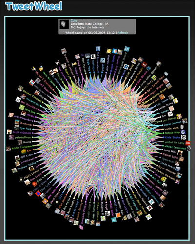
a visual representation of one's Twitter network, distributed over a circle, similar to ludios circular network graph,
there seem to be plenty of twitter stream visualizations out there, although only one has been blogged here before. do you know any other examples worthwhile to be included at infosthetics?
[link: ]
see also:
. circular email visualization
. circos
. gnom
. wikipedia clusterball
. schemaball
. mammal supertree
. document icons

 Time and Date follows Time Zone (Brussels)
Nathan at Flowing Data has you covered: http://flowingdata.com/2008/03/12/17-ways-to-visualize-the-twitter-universe/
true, of course.
out of his list, tweetstats seems to be worthwhile.
Must say it looks very pretty. Reminds me of a 70's picture I had hanging up
Yes i too like tweetstat