
an online information dashboard that summarizes & graphs the Internet activity relating to the 2008 presidential elections, in an attempt to compare the similarities & the disparities between the mainstream media & user-generated content.
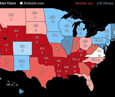
perspctv's current graphs include the "CNN national poll of polls", news mentions, blogosphere mentions, Twitter mentions, a US electoral map & Google Trends-based timelines comparing the names of the candidates.
[link: |thnkx ]
 Time and Date follows Time Zone (Brussels)
Cool Graphs,
and a very interesting angle on the presidential election. Personally i rely on the polls.
I use a widget to keep track of the progression of them.
The widget shows the election polls by strength of states.
In addition to other different graphical visualizations of data, this one displays the progression of votes over time.
It gives a great overview!
http://www.youcalc.com/apps/
... and its easy to put on your blog!
Make a difference, keep on voting!