
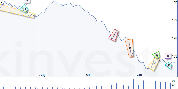
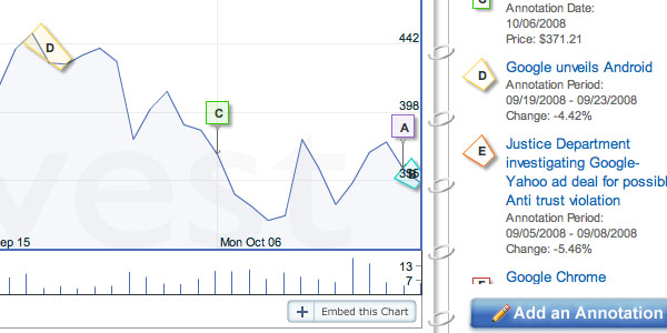
[wikinvest.com] has a feature called which allows users to share annotations on financial charts (e.g. , ). The annotations are displayed in a similar manner to the ones used to indicate news stories () on , however they can also span ranges to help explain changes over time.
Wikinvest's chart is extremely well executed and features the same dynamic axis and multiple time ranges as Google's, as well as their own additions for user-submitted annotations. Like Google, wikinvest chose Flash for their interactive chart, a choice I believe is justified until there is a cross-browser standard for interactive vector graphics in javascript. Despite in that direction it's still extremely tricky to get a reliable, fast and uniform experience using javascript and canvas (or SVG).
Google's chart is well respected and has inspired at least one , although wikinvest's version is the first I've seen that exceeds Google's features while achieving the same quality. I'm sure there are many more to come, provided people pay attention to the small details that make it a responsive interactive experience.
The idea of graphical annotation of charts is one of the concepts explored in which fed into the Minnesota employment explorer, some of the work at and the newly-launched . It seems only a matter of time until tools like these converge with software such as to allow contextual annotation, embedding and sharing for all online content.
See also: sense.us, Minnesota employment explorer and Many Eyes.
Guest blogger is an interaction designer at . He has recently contributed to several successful visualization projects including , and .
 Time and Date follows Time Zone (Brussels)