
[betterworldflux.com] is an impressive interactive data visualization created as an entry for the competition. The project aims to raise awareness for the by letting users visualize and share the valuable stories that are hidden in the .
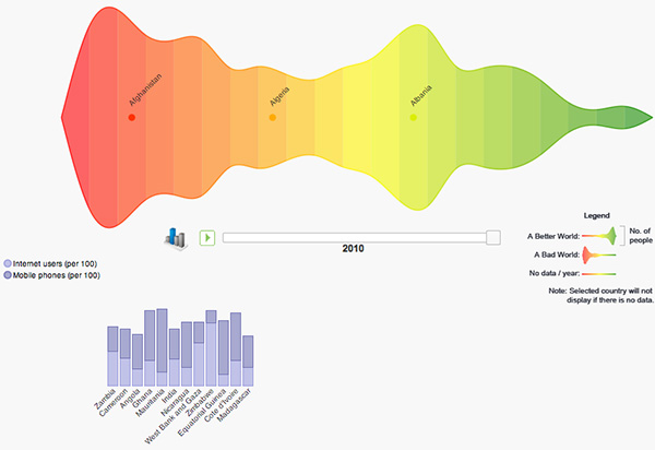
Flux basically consists of a powerful histogram view that summarizes the world state for a given year, with the color green representing 'good', and red being 'bad'. Within each color band, a number of countries are aggregated. The width of Flux ribbon corresponds to the total number of people living in those countries. Each country has a color based on a composite score calculated as the geometric mean of the user-selected indicators for any given year. These indicators can include aspects like 'Average years of total schooling', 'Happiness', 'Ratio of female to male primary enrollment', 'Access to Water', or 'Prevalence of HIV'. Users can thus choose the specific indicators and countries, explore the resulting histogram for trends and patterns over time, and share the resulting visualizations online.
Thnkx David!
 Time and Date follows Time Zone (Brussels)
Very nice! We've also submitted a visualization, built in Protovis (so ours doesn't work in IE unfortunately). You can see it here: http://www.janwillemtulp.com/worldbank
Histogram with a mirroreffect. Why?
Aesthetics. But it would have been just as pretty without it I think. Just makes understanding the data harder.
These histograms hold extreme visual and information value. In fact, this entire website contributes to a whole world of statistics and art, what an odd combination. I'm not sure if this has been considered (or exists) but having an exhibit of sorts of these graphs would have so interesting. To visualize the state of a country is an amazing concept!
kristenwishon.wordpress.com