
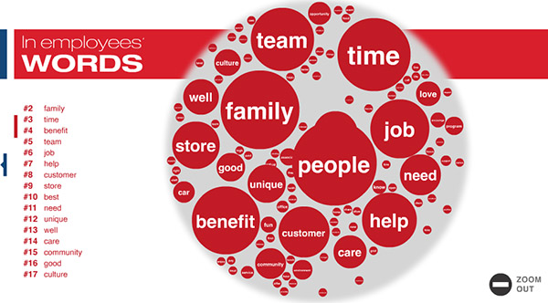
[cnn.com] is a fun and engaging visualization that shows the best companies people want to work for, according to Fortune Magazine.
Next to showing the obvious ranking values, the collection of blue bubbles also reveal the most popular words workers used when describing their companies in the survey. The 'red' interface allows for the further exploration of the most important keywords, together with a small sampling of the accompanying comments.
 Time and Date follows Time Zone (Brussels)
Nifty dashboard, but it's over-animated and the amount of time it takes to get any value is far too long.
Interesting visual, but the floating circles drive me a little batty (there's no need for motion!).
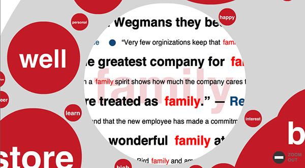
I'd call it garbitsch, have a look for example at the term car. The quotes containing the word go along the lines "your career..." or "...take care of..." highlighting the sequence c-a-r even within "care". If they examined the rest of the text like this it's worthless. (Maybe Fortune Magazin is Fortune Cookie Magazin and I missed that.)
...found another quite interesting one. A search engine's employee said: "...and some really bright, solution..." whereas r-i-g-h-t is highlighted and the quote put under "right"...or wrong...or left...or bill of rights...or human rights...really b-right.