
The maps from Eric Fischer are ever beautiful and insightful. He is the guy behind the surprising maps that compare the locations where people use , that reveal the geographical distributions of , and that contrast the places that are photographed by .
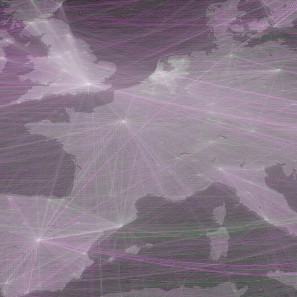
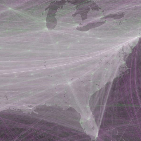
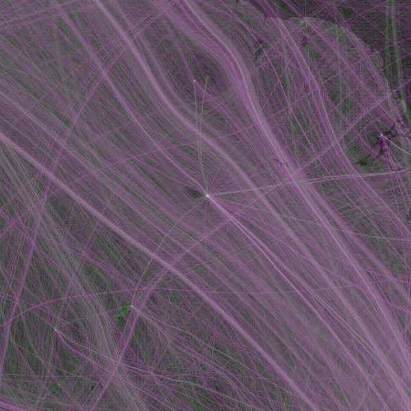
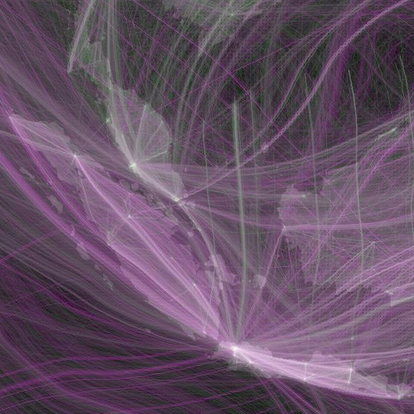
Eric's [flickr.com] shows the locations between different tweets of the same people (green), and compares those to the locations of people that @reply to each other (purple), as recorded by Twitter between May and September 2011. The concept to derive human travel from Twitter data is a bit similar to Jer Thorps' Just Landed, although here the locations are completely determined by the differences in geotags of the tweets, and not partly by the location as mentioned in the Twitter profile.
Also check out his of 2011.
 Time and Date follows Time Zone (Brussels)