
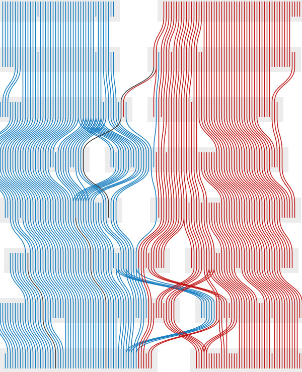
The interactive flow graph [friggeri.net] by French PhD student Adrien Friggeri reveals how US senators have agreed (or disagreed) over time.
All historical US Senators were subdivided in overlapping groups of agreement using a custom-made community detection algorithm called C3, which was specifically designed to detect maximally cohesive groups in a network. Here, I guess the network was created from recognizing how people voted for specific bills.
Each row in the vertical graph represents one unique session of the Congress. Senators are represented by paths (i.e. Democrats, Republicans, Independents) which are grouped in gray boxes when they are part of the same agreement group. Since a person might be part of several groups during a same Congress, some of the paths have branches towards both the groups the Senator belongs to.
Although the algorithm was able to consistently discover two distinct groups, it still sometimes arrived at 'wrong' results (e.g. placing a Democrat in the Republican group or vice versa).
Thnkx Adam!
 Time and Date follows Time Zone (Brussels)
Actually, just to clarify, the algorithm did not arrive at "wrong" results, it did place Democrats in the group with a majority of Republicans (and the other way round), but I went at great lengths to explain why by looking at factual data about the Senators involved.
Is it possible that the anomaly in the 108th congress is being influenced by this?
http://www.senate.gov/legislative/LIS/roll_call_lists/roll_call_vote_cfm.cfm?congress=107&session=2&vote=00237
It was in the 107th congress, but it was late in the session, and many of the names line up.