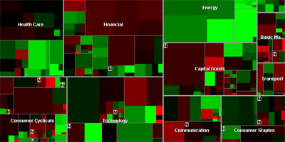
 a quite old (1998?) but still powerful interactive treemap visualization that shows the changing stock prices of over 500 publicly-traded companies on a single screen, providing users with a (almost) real-time overview of the stock market at a single glance. each rectangle represents a single company, with its size being proportional to its market capitalization. its color encodes the change in the company's stock price over a set time period, while the color saturation denotes the relative size of the stock price change (either negative or positive). see also google newsmap. []
 Time and Date follows Time Zone (Brussels)