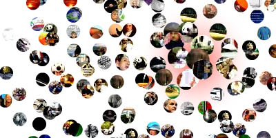
 an impressive dynamic data visualization showing a large collection of science news stories. the individual beads represent the ever-changing zeitgeist of science news in the world, populated automatically every few hours by a computer program that parses several online news sources & blogs that focus on science. the color makeup of the insignias change, with each dot taking on the average color of its corresponding photograph, & then quivering with Brownian Motion. the user can alter the focus between science & culture with a slider, altering the composition of the visualization between respectively a static square & random movement. its visual structure is derived from the Fibonacci Sequence & closely related to the Golden Ratio, to emphasize a space where science meets culture.
see also ten by ten & wordcount from the same great developer, . [|via ]
 Time and Date follows Time Zone (Brussels)