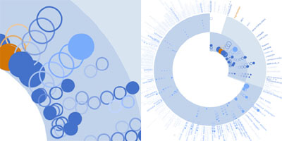
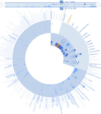
a novel data visualization method that shows the progress of individual participants’ code & the comment contributions to open source software projects. the design of the "bloom diagram" blends techniques such as concentric pie charts, animation, motion trails & social proxies to produce a compact presentation of the large scale dynamics around software development.
the inner ring represents "code events" (changes to a file in the code repository), the outer ring represents "comment events" (postings on the project's mailing lists, forums & bug trackers). when a user moves a timeline slider, animated bubbles appear in the inner or outer ring, representing the events. the animated bubble position provides a cue about the frequency & recency of the event.
see also ambient lava lamps & code profiles.
[ & (pdf)]
MORE
 Time and Date follows Time Zone (Brussels)
Wow, very nice find. Just wanted to mention that PDF is not accessible since the 'download has expired' and accessing the page through the official link is available only for members.
I realize the PDF is only accessible for ACM members (basically universities). fortunately, the online article at IBM provides a summary.