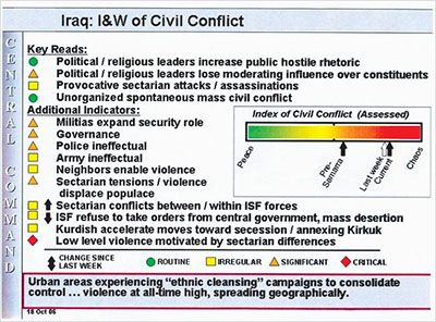
while the content of the slide is clearly shocking & thus the actual subject of the news story, I was also intrigued by the visual design of the presentation. a color-coded bar chart is used to illustrate an “Index of Civil Conflict", while a list of abstract color-coded icons (i.e. triangles, squares & arrows) & summarized textual facts 'decorate' the left side of the screen. how effective is this slide in communicating the actual situation, & the data on which it relies?
see also Tufte's about the quality & credibility of informational Powerpoint presentations.
[link: & ]

 Designed and Maintained by
  Time and Date follows Time Zone (Brussels)
It could be much better. The most obvious problem is that because the same colors are used for the index bar and the icons, I tried to find a relationship between the two.
Same thing happened to me. I saw "unorganized spontaneous mass civil conflict" and wondered how that was an indicator of "Peace".
I think the "index" part is unrelated to the rest of the information. The legend at the bottom is what you should reference. The colors and shapes are not independent. They're like "green clovers, blue diamonds, etc." So you can see that "unorganized spontaneous mass civil conflict" is actually "routine."
Not to say that this slide is useful. In fact, I can't get to the Times article to find out.
So how is this PowerPoint's fault? It's not like PowerPoint forced them to cram everything onto one slide and use some ambiguous color scales. This is simply bad layout, organization, and communication, and you can do that just as well with Keynote, Quark, or InDesign. It's a bit too easy to blame a program (which is a tool, nothing else), the problem clearly lies somewhere else.
it clearly is not the mistake of the Powerpoint software itself, but it definitely makes it easier to generate inefficient layout.
Maybe people like russell and trogdor should be given a sidearm and told to clear out a building or defuse a roadside bomb. As they do this we could have some military boys having a giggle and making snide remarks about how 9-5 desk warriors can't cut it in the field. Get my point?
that is an interesting remark, danny. this metaphor can be applied just as well for the military, who should then not be amazed about their lack in communication skills.
frog Design did two redesigns of this slide to attempt to improve the information design.
SEE: http://www.frogdesign.com/iraq_conflict_slide_redesign/
thnkx Dave,
I have posted the redesigns here.
Wow...this slide is truly terrible.