personal life pie charts

4 April 2007

personal_pies.jpg
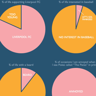
a collection of pie charts that represent information related to one's personal life, such as the percentage of life already spent versus the average life expectancy, time spent in a relationship, % of life "with a beard", & "% of neighbors I've been friends with".

see also personal annual report 2007 & personal annual report 2006.

[link: flipflopflyin.com]

add to delicious.gif add to digg

recent entries

emotionally vague survey results 2008 presidential election in the blogosphere distributions of sport world records TerraForm people-based infographic movie subway map bathroom tiling Mycrocosm personal data graph portal Fleshmap crowdsourcing sex physical information sculptures Ben Shneiderman as interface to infovis visual poetry 2007 & 2008 wireless wifi strength heatmap debategraph debate maps John Lennon interview infographic movie analogue eco-visualization

extra

personal_pies2.jpg

shop

post a comment