
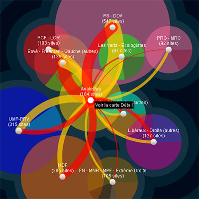
an impressive interactive data visualization based on the political playground of the French blogosphere. the "blogopole" represents about 2000 blogs that focus on political themes, which were analized in the context of the past 2007 French elections.
the first view allows users to select a more detailed part of the map by either a political stream or by a small, representative sample (yellow circle in the middle). the node color corresponds to its different political party. the node size represents the authority of the website, such as its Google PageRank, authority, or number of inward links. the positions of the nodes are purely topological in that the force-directed algorithm attempts to minimize the number of overlappings.
[link: ]
 Time and Date follows Time Zone (Brussels)
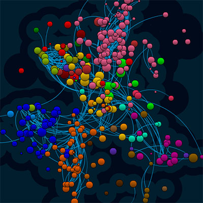
Nice visualization, what I like about this one (as opposed to most social network visualizations) that this one makes a clear differentiation between incoming and outgoing connection