
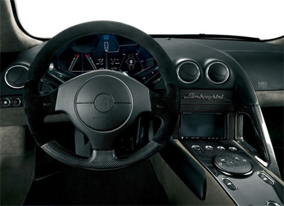
the stealth-like, information-rich dashboard design of the car.
next to an impressive car, does $1,000,000 buy you an effective visual design?
[link: (higher rez pic)|via & ]
the stealth-like, information-rich dashboard design of the car.
next to an impressive car, does $1,000,000 buy you an effective visual design?
[link: (higher rez pic)|via & ]

 Time and Date follows Time Zone (Brussels)
It's not to diss on other's work, but it doesn't look like a smart and efficient way to display the necessary information. First it looks like it has two engines. Then what are the two % gauges beside what looks like the speedometer? A % of max potential speed? Then why linking the RPMs with the gear?
Ok, like anyone else here i'd probably drool on that car... but, well, what's good in F-22 cockpit isn't necessarily good for a car...
Marcello
Oh, almost forgot, they didn't even find space enough to write "pressure" or "temparature"! ;)
M
Marcello re: your comments about "smart and efficient." Are either of those words you would associate with Lamborghini design? It only follows that the dash-display for a luxury car would have a sleeks, highly streamlined aesthetic. Regardless of utility, it is nice to see a high end automobile with a dashboard that doesn't look like it was ripped out of a WWI fighter.
Good find Andrew!
Correction: it's 1,000,000€ not $. You've got to pay a lot more dollars than 1M to buy that bad boy ;)
IMHO the dashboard is perfect for a car whose design is clearly inspired by jet fighters.
so I think the designers' task wasn't getting the strongest "information efficency" but "overall design coherence".
meelis, OK then it is about US$1.5m (forgot where I originally found that number, but I am quite sure it said $).
marcello, I also noticed how they used both icons as well as abbreviated text for the same attributes. not sure why some graphs seem to be mirrored?
The text is in Italian:
"Giri x1000" = "RPM x1000"
"Benzina" = "Fuel"
"Temp. Acqua" = "Temp(erature) Water"
"Press. Olio" = "Press(ure) Oil"
The left-hand side lines surrounding the gear (1 through 10) are therefore the RPM, while the percentages on the right-hand side are not clear.
Actually, most things on the right hand side are kind of unclear.
I agree with the others above that this dashboard was probably inspired more by a 'design statement' than information delivery efficiency.
And I also agree that, for that price, you'd expect they'd do the best possible job, even in details like that (which imho should be to make the most efficient and practical dashboard first, and an additional design statement second).
PS: the wikipedia entry linked in the article gives some info on the elements of the dashboard (such as the G-Force Meter !)
PS: the wikipedia entry linked in the article gives some info on the elements of the dashboard (such as the G-Force Meter !)
(if this comes across multiple times, sorry.. I'm getting CAPTCHA errors)
thnkx f.o.r. for the clarifications.
sorry for the errors, it sometimes happens when the browser uses a cached CAPTCHA image. fully reloading the page should solve the problem.
@Greg J. Smith: well, actually it depends on what you mean with "smart" and "efficient". i think something can be "completely over the edge" like a lamborghini and still be smart and efficient (obviously not from a fuel MPG point of view! ;)). even better, i expect, from such a high tech car that everything is not only nice looking, but quite possibly the best of breed in its field.
don't get me wrong, i like the multi-CRT approach instead of the plain old dials. yet i think that, with the complete freedom that a digital approach and a unlimited budget offer they should have been able to come up with something both sleek and efficient. especially without "errors" like icons+text for the same indicators and lame abbreviations.
M
I think this is the "optional" view. you can see video of it at about the 1 minute mark here:
http://www.youtube.com/watch?v=xtfmMsP2Tls
Love the car, but the dashboard is a little strange for me... Guess I'd have to be in the vehicle to see the feel of it.
I think the dashboard looks stupid. Like someone was watching too many episodes of the old Knightrider show and thought, "Hmmm that's what we need for a 1 million Euro car!" Maybe David Hasslehoff would like it, but most people wouldn't.
LOL
It's pretentious. We've been enculturated to understand visual information in a certain way in a car. Putting F-22 visual language in a car regardless of its asking price does nothing to aid the driver at hand.
This is the best machinie ever created by god.. It dont get better better then this.. I wish i could afford one :(
The dashboard is the sexiest thing i have ever seen.... If your in it,,, it would seem ur flying an UFO... Only the RICH can understand its COMFORT!!!!!!!
persuasionhttp://www.persuadedme.com - .Betimes on, I abstract that set is a gink of the most sincere effects skills to evolve if you beyond the suggestion of a guests doubts neediness to be in conductor and concluded all you can in life. After information this involved technic, I indisputable to surety my lifestyle tow-haired and on the up more specifically to the founding of influencing and bent because I knew it was the contrariwise management I would draw unskilfully my loftiest dreams. I contemporarily seascape that class of reasoning permeates daytoday life, influencing hundreds of decisions muscular and unprofound