
What is Data Visualization? How can it be explained through a visual diagram? Can data visualization be... visualized?
David McCandless answered this recursive issue on his impressive blog Information is Beautiful already a while ago, with a that combines the concepts of "Interestingness", "Function", "Form" and "Integrity".
More recently, FFunction attempted to simplify the depiction of data visualization further by proposing a that mash the areas: "Information" , "Design" and "Communication", with its many intermediate steps.
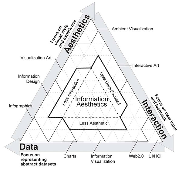
It actually does not necessarily stop there: we (PDF), the combination of "Aesthetics", "Data" and "Interaction".
You can compare the three approaches below.
Are there more models around? Do you have any preferences?


 Time and Date follows Time Zone (Brussels)
Great information!
But i think it's called Venn diagram, from the inventor John VENN.
At VISup we have tried to put down what are Infovis and Datavis for us http://flic.kr/p/8gBro6
I love the McCandless' style but in this case I appreciate the FFunction one: the relevance of the multidisciplinarity is weel exposed here.
in my opinion, your 2007 approach stands unrivaled as it is the only one that seeks to present the field honestly... and manages to avoid falling into a naive assumption of symmetry.
I like them all.
Best perhaps the 2007 one.
Sadly the all to seldom used tertiery diagram is misrepresented. The 3 axis in such a diagram are not directed the way shown in this picture.
http://en.wikipedia.org/wiki/Ternary_plot
I think there is a mix up between the diagrams.
The middle picture is McCandless
i prefer more metaphorical versions like this: http://www.goatseo.com/meta-data-display.gif
@ Jörgen: You are right. I have changed the names to correspond to the correct diagram.
I like the second one because it's simple and easy to understand. Four elements are mentioned:
1) Interestingness: anyone cares about what you want to say?
2) Integrity: is what you say the truth?
3) Form: are you saying things in a nice to hear way?
4) Function: are you able to make what you say easy to understand?
Hope I am understanding in a correct way~
I have not seen the third one before. Thank you.
I find the first two more interesting in an aesthetic way. FFunction's is nice but McCandless's body of work is so exhaustively good, I think of him as as Tufte 2.0, with all due respect to Sir Edwin. The middle example has just the right amount of information, for me.
All 3 are interesting - the last one probably the best (even if it is the least visually attractive)! McCandless is Tufte 2.0? More like Tufte 0.3. His book is pretty good - but is seriously flawed with missing info throughout and a repetitive design approach.