
This post includes 2 intriguing and beautiful infographics.
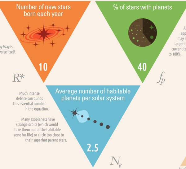
The , devised in 1961 by astronomy professor , is a mathematical equation used to estimate the number of detectable extraterrestrial civilizations in the Milky Way galaxy. Although it is not a rigorous equation, it offers a wide range of possible answers. The Infographic "" [bbc.com], designed by , makes the equation more accessible by allowing people to interact with its various parameters, such as "average number of inhabitable planets per solar system" or "% chance that life develops intelligence". While not heavy on data graphics, the little icons subtly change according to the data input.
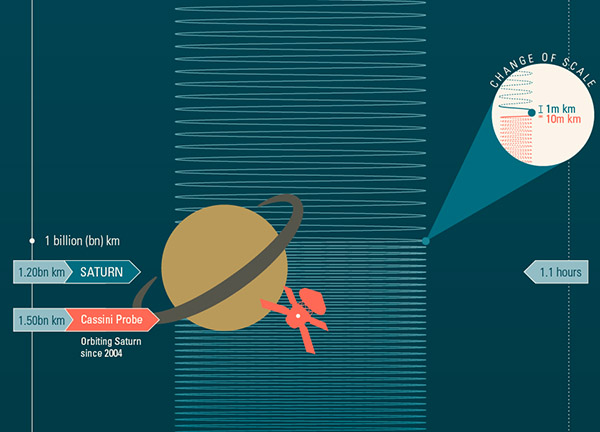
"" [bbc.com], also designed by and Information is Beautiful, depicts the physical size of our solar system by way of a long, long infographic that spans about 27 pages of A4 paper (when printed). Note that the vertical scale changes along the infographic.The accompanying news article can be found .
 Time and Date follows Time Zone (Brussels)