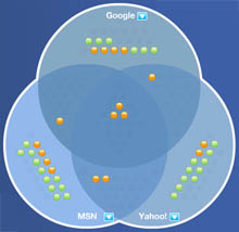
 an interactive data visualization that demonstrates how the top results of different search engines (e.g. Google, Yahoo, MSN, AskJeeves & Dogpile) overlap or differ from each other. quite interesting to explore how we tend to perceive 'the Internet' through the very narrowly focused view of a particular search engine. []
 Time and Date follows Time Zone (Brussels)
See also the Search Engine Relationship Chart ( http://www.informationlab.org/index.php?p=124 ) by Bruce Clay. It shows 'who feeds who'.