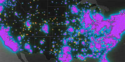
data visualization as advertising: a visual world map of the 'collective mood' of users: the interface queries the current mindset ('chill') of a user, which is then mapped to a brightly colored dot, merged & displayed on top of a geographical world map. this map also displays additional data & text messages submitted by other users, all placed on the appropriate geographical locations. []
 Time and Date follows Time Zone (Brussels)
Isn't this functionally nothing more than a map of where the most connected/wired people happen to live? Nice interface, though (what with the clicking and zooming.)